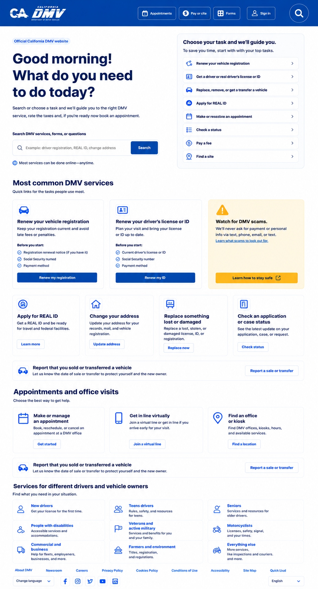
Static service gateway
Replace the hero carousel with one clear decision area: search, choose a task, or say “I’m not sure.”
- No auto-rotating content
- No critical text over busy photos
- One main page purpose
A practical redesign direction for the California DMV homepage, focused on clearer task routing, lower cognitive load, stronger accessibility, and a calmer public-service experience.
The original page has useful content, but the hierarchy asks users to do too much interpretation. These callouts translate each friction point into a practical redesign action for task clarity, neurodivergent accessibility, and ADA/WCAG-aware usability.
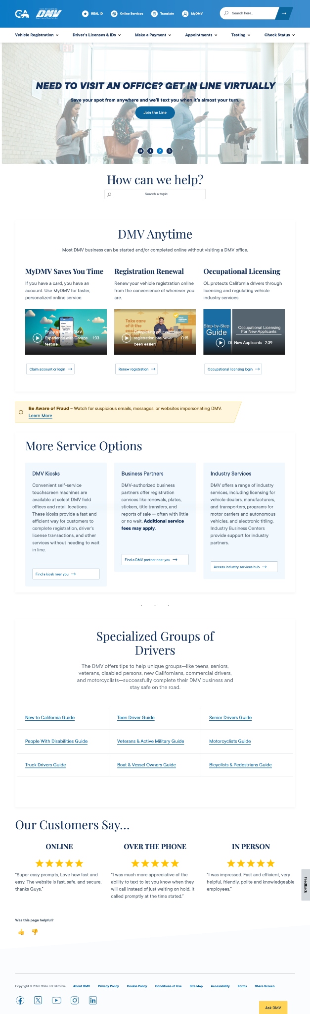
A DMV homepage should not feel like a brochure, a menu drawer, and a waiting-room poster had a baby. It should route people calmly and clearly.
Replace the hero carousel with one clear decision area: search, choose a task, or say “I’m not sure.”
Use user-language categories instead of requiring people to know DMV terminology before they start.
The fraud warning should stay visible, but it should be integrated into the task flow instead of interrupting it.
The redesign should support neurodivergent users, screen reader users, keyboard users, mobile users, older adults, and people arriving under stress.
Use Inter consistently, short sentences, clear headings, and helper text that answers what users need before they click.
Every button should state the outcome: start, check, apply, replace, report, pay, schedule, or sign in.
Test contrast, focus states, keyboard access, heading order, screen reader labels, zoom, touch targets, and mobile layout.
Fix the highest-risk issues first, then tighten the experience until the page feels obvious instead of procedural.
Remove auto-advancing carousel, improve contrast, expose focus states, label controls, and prevent widgets from blocking content.
Add the guided task finder, reduce competing CTAs, use plain language, and provide “Before you start” guidance.
Move office visits lower, simplify specialized groups, demote testimonials, and improve card consistency.
Add time estimates, appointment indicators, “what happens next” microcopy, and later life-event pathways.
When the page behaves like a calm service concierge, users can answer the important questions faster: Am I in the right place? What do I need? Do I need an appointment? What happens after I click?